")
As you know I have already created two blogs on the creation of my Disney poster, the first on the creation of the character Stitch, and the second on the creation of the character Lilo. This will be the last blog on my Disney poster because in this blog I aim to speak about how I created my background for the poster, and how I put all of the things I have created for this Disney poster together, to create my final Disney poster piece.
When starting out creating my background for my poster, I followed the same process as I have followed for every other part of my poster, firstly I followed my precautions from my risk assessment, like for example no food or drinks around the computers, and no bags in the for people to trip over, then I went to my image blog where I have had my chosen image sitting waiting for me to use, which has become very handy over the course of this production period, then once with my image for my background I was ready to begin.
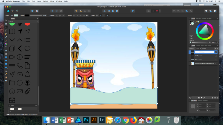
The image I had chosen for my background was very simple indeed, I chose this due to the fact I didn’t want to bite off more than I could chew, due to the fact we haven’t had a lot of time for this project, unlike others like our final major project, where we had a number of months, and I also have chosen quite detailed hard to make characters, so I thought that if I had a too overpowering background, that it could ruin the effect of the poster. Because of this simple background, it only took me about 20 minutes to create, as all I had to draw was some sand, sea, hills, sky and a couple of clouds, a breeze compared to the characters I had to draw. The hardest part of the background was the two flame torches that I decided I wanted to add in to add to the Hawaiian theme, but even they were just some shapes. Throughout creating my background, very much like when I was creating my Lilo character I did a very good job of keeping everything labeled and grouped, which helped me to stay on track, and not know where I was up to at all times.
Once finishing I looked back at my work and I wasn’t proud, that background just didn’t look good there was something about it that just didn’t look right. to try and help the situation I asked a friend his opinion, and he said that maybe it needed some shading, so that the hills and the sky looked more realistic, instead of just blocks of colour, as even though it is animation, I still has to look realistic not just a block of blue for the sky. After hearing his advice, I decided to take his advice, due to me not knowing what else to do to make it look and better, and I was determined to not have to redo my background. After using the colour wheel to add some gradients into my background, and having a play around with how sharp I wanted the gradients to be, and what colours, I looked back on it and it looked so much better, but I still wasn’t happy. From here I decided that I was going to delete the clouds I had copied from the image, and draw my own, as the clouds weren’t very Disney style clouds, they were very flat and not very shapely, whereas when you see a happy film poster you expect to see fluffy rounded clouds. After redrawing my clouds I was much more happy with my background, I didn’t love it but I thought once I have completed my poster the focus wouldn’t be on the background so much anyway, so I moved on to assembling the poster.
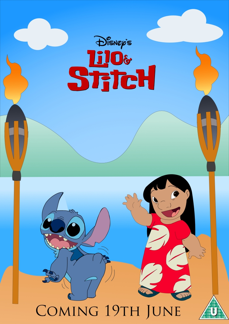
For this part of my production I ensured I had my sketches with me at all times, so I could keep referring to where I wanted everything to be positioned, and placed, I also used my colours, fonts, and layouts blog to refer back to the layout I want to use to ensure again I put everything in the correct place. Once with these pieces of planning that I will need I set to work adding my characters from my assets into my poster, once all in and in the correct places, I used the text tool to add some text, for the title and release date. To do this I went back to my font research, as in there I had some examples of fonts that I thought would look good, after comparing I finally found one that the software had that looked good with poster, however after writing both the title and the release date in that font one of my teachers said to me that they didn’t like how the title looked in the font, as it was too plain for a children’s film, as it was just a standard text, like off a word document, not one like off a film poster, which is usually colourful and in a bubble sort of font. To combat this I decided to keep the release date in the font I had chosen, but for the title go onto the internet and find a png of the title Lilo and Stitch, the one that you can see below.

![]()
Overall I am very proud of how my Disney poster turned out, it was definitely hard work, and it didn’t come without its complications, however, I am glad I have finished it and I am proud of how good it looks, I was also very proud of how helpful my research and planning was to me in my production work, telling me that I did the right sorts of planning and research for me to use them as much as I did through my work. I am excited to move on to my horror poster soon.
